
Savar Building Collapse. Source: Flickr/Rijans
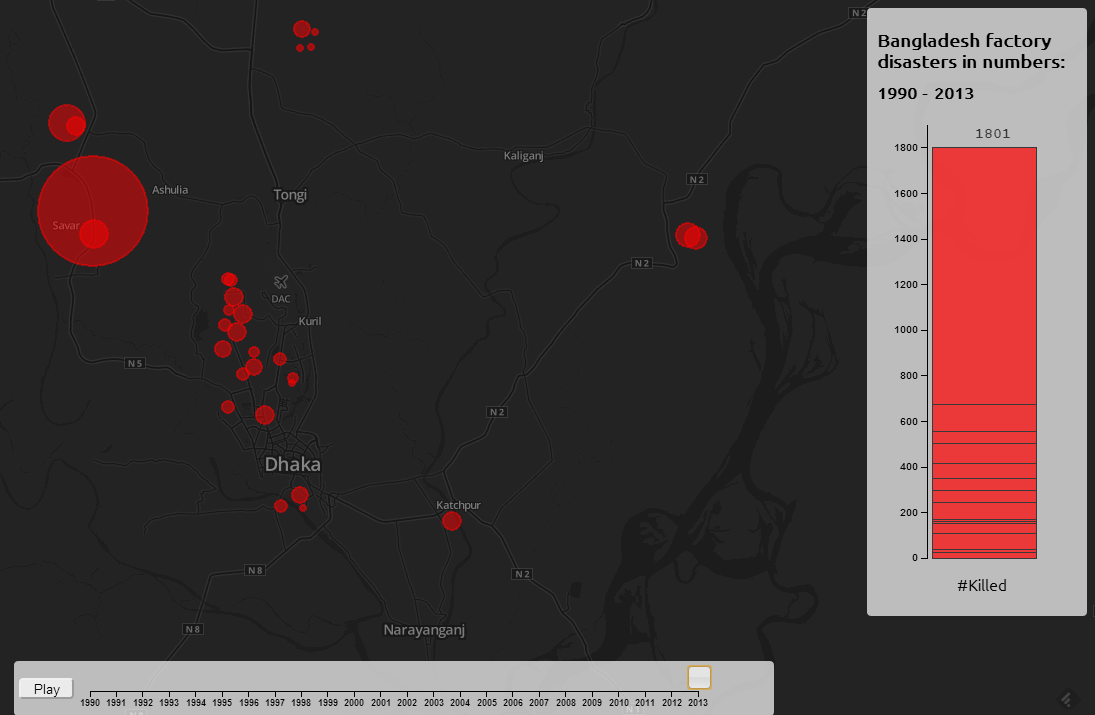
A tool for exploring the data on disasters from 1990 to present. Clicking on a dot will show more data on each incident.
I'm ashamed to say that I had precious little knowledge of clothing factory disasters in Bangladesh (particularly Dhaka, the capital) before the recent Savar Building Collapse that made a big impact in the headlines. Years ago I tried to demonstrate some concern about sweatshops by not buying stuff from GAP (not that I could really afford it anyway) but over the years I've suppressed the worries with the vague notion that after so much public concern, things must be better by now. I still can't tell you much about Sweatshop conditions, but Birgit and I did look into the history of disasters within the clothing industry in Bangladesh. We didn't have to look too far to find shocking catalogues of death tolls due essentially to poor building standards and inspection. A few reports that deal with the history of incidents and their causes are:
Hazardous workplaces: Making the Bangladesh Garment industry safe
Fair Wear Foundation Background Study BANGLADESH, Fair Wear Foundation, 2006
Wanting to do something, and, we freely admit, wanting to try out some web stuff for something useful and of interest to people, we put together a year-by-year visualization of the disasters. Most of them are in the area of Dhaka, but zooming out will reveal a couple in the port city of Chittagong aswell. We come to a total of 1801 deaths from 1990 to 2013. Many death totals are disputed, and this number is probably quite conservative. The source(s) of the information and, where available, details on each incident can be viewed by clicking on the dots. You can take a look at the draft version here: clothing.norainnosun.de. This was a learning experience for us in multiple ways, concerning the technical difficulties there are a few comments below, if you're not interested in that sort of thing you probably can stop reading now!
We used this project as a way to try out CartoDB, a system for quickly creating visualizations of geographical data. Although the visualization does still grab its data from a CartoDB database using their API, we quickly ran into the limits of what their visualization system can cope with. The main problem was that the creation of the layers displaying data is done automatically based on a query, which meant a new database query for different data sets (in our cases, each year). It is also done using rendered tiles, making everything slow (although I am new to this and can't be 100% certain that there isn't a way to do it with vector graphics). By doing the layer generation ourselves (using Leaflet, which CartoDB can also use), separately from the database query, we could easily generate vector graphics layers based on whatever data we wanted and have it displayed or not more or less instantly, which was necessary for the slider to work. What is however still very cool about CartoDB is that you can essentially do database queries directly with Javascript. Their georeferencing facilties were also good for getting the points on the right place on the map based on addresses. As for the stacked bar chart, that is done using d3.js, a great library for data plotting. It is (for me) horribly low level, but I'm gradually coming to understand it. Not enough however, to make my own dynamic stacked bar chart in a few minutes, for that we adapted code kindly placed online by Ben Christensen.