Birgit and I (Matt) have enrolled ourselves in a massive open online course on Introduction to Infographics and Data Visualization, run by the Knight Center for Journalism in the Americas and taught by Alberto Cairo. Although both of us have years of experience visualizing experiment results, the areas of infographics and presenting data for the general public are things where we don't have much experience. And in any case there's always something you can learn about how to present data, even if its 'only' for a paper or conference presentation. In addition, interactive graphics are becoming more and more important, and happily Alberto is covering those in the course too. For me its also a new experience to take part in an online course but perhaps more importantly in a course from an American university (University of Texas, in this case). There are short lectures to watch, lots and lots and lots to read and "quizes", something I think I only experienced from an American lecturer at York. Anyway, none of that is complaint, its just interesting, and for me a bit weird to have university deadlines again after almost 6 years.
This post is about the first week's assignment, which was to examine one of a set of infographics and give some critique. I chose a rather "fun"-loooking graphic that examined travel expenses of Obama and Romney on the campaign trail in 2012. Overall I found the graphic interesting, and the liberal pasting of photos/logos all over the place kept it colorful and entertaining, even if it didn't add much to understanding.
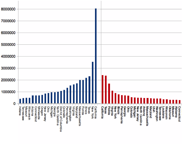
In terms of understanding, one simple improvement would have been to order the state donation data by donation and also split it into two: democrat and republican. It might also be nice to see normalization of donations by population of the state. California is a very populous state. Making comparisons was really difficult for me. The data is easy to find (I did it for the whole campaign, sources: X, Y: ) and I've done a couple of quick example plots:
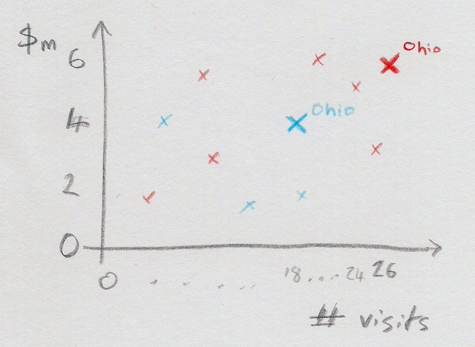
Furthermore, a scatterplot of some kind showing the amount of money spent in campaigning, or even just days of travel in the state, vs. the amount in donations from the state, would have been interesting.
I do ask myself why the concentration on donations? Obviously campaigns need money, but isn't the main aim to motivate supporters to raise awareness and also to motivate them to vote? I'm not from the US, so maybe I'm not familiar with the main aims of rallies and tours.
Although the graphic presents some fun facts, it is hard to ascertain what "effect" the money had except for donations, and even these are not plotted in anyway against the effort spent on each state (a simple scatter plot, for example, would have made comparison of "returns on investment" possible). One can do it for Ohio just because it is there in plain text. Below is a sketch of what I mean:
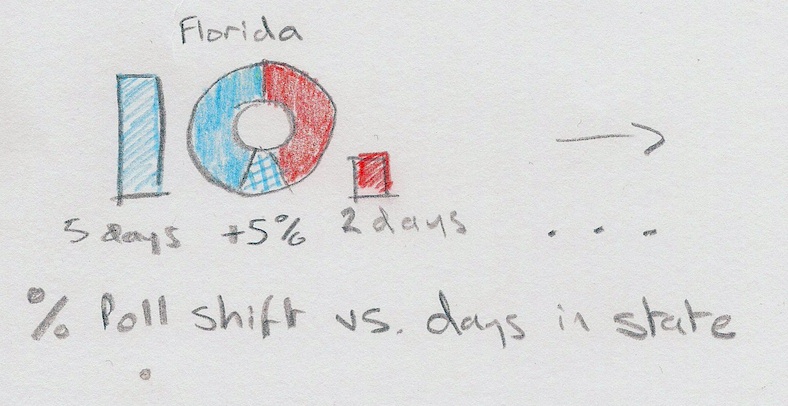
Apart from donations, the addition of some before and after polling data might have helped. I haven't had time to search out the data there, but I guess one could show the "swing" in direction democrat or republic with a bar on each side showing the amount of days or money spent in travel on the state. The money could be normalized such that it is plotted with respect to the total money spent by both campaigns, and then labelled with the actual \$ or days sum. I made a sketch of what I mean - probably one doesn't need to do it for all states - just ones with a large change and/or large amounts of money spent:
One small thing - regarding the number of hotel visits - why is the difference so big - do some hotels like to give the President free lodging? Some background info would have helped.
Overall, the graphic is interesting, but I am immediately drawn to ask more questions, which are not necessarily relating to travel. I know the author wanted to make a graphic about travel in the campaign, but I fear it is too narrow a focus to answer the questions it brings up.