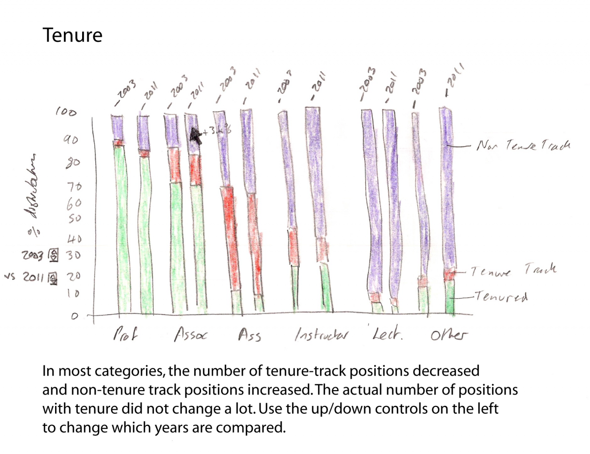
Its been a rough couple of weeks with sickness in the family, and I'm a bit behind with the course. Nevertheless after pouring over some sample data for week 3, I've taken a stab at the exercise. I haven't had time to look at other people's ideas/entries yet, but I'm excited to see them, as I feel like mine is lacking something somewhere. And of course, there's probably a few different ways to show what's important, and different stories to tell. The data can be found here: http://www.highereddata.aft.org/instit/national/tenure_rank.cfm, although apparently there's a small error ("In the line "assistance - On tenure track" displays a growth of 14.293 and 31,3%. This is an error (copied from line below , "non tenure track"). The correct number is 16.709 which corresponds to 19,95%." - http://open.journalismcourses.org/mod/forum/discuss.php?d=1448). I used the corrected data.
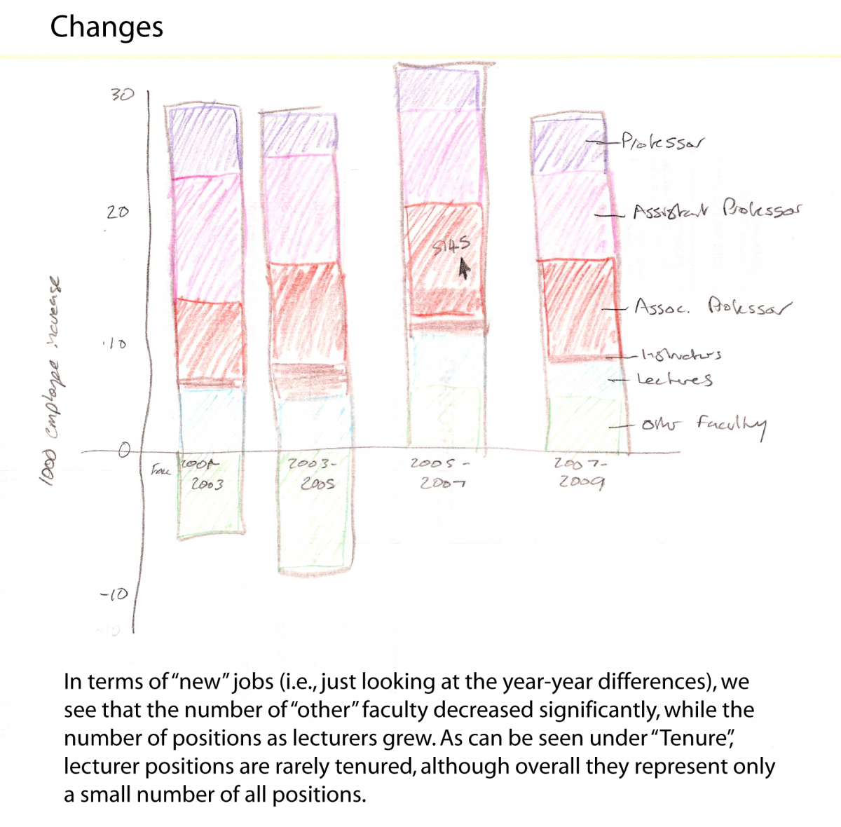
I took a quick look at the data to try and figure out what was going on. The biggest change seemed to be in the numbers of lecturers, but as they are a somewhat small group, it took some thinking to figure out how to show it best. I mislabelled years in places, but overall the sketches are just to give an idea of what I would do and much of the plotting is numerically inaccurate, even bars relative to another. I would use mouseovers to show more details (shown in some places), and probably add a percentage change label here and there (not shown).
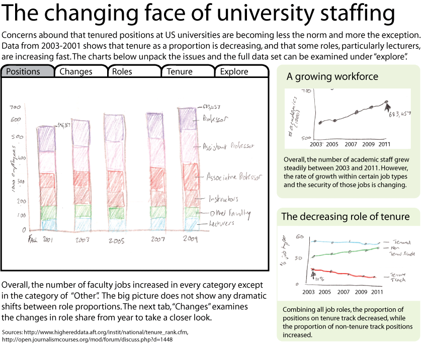
Main display:
Changes Tab:
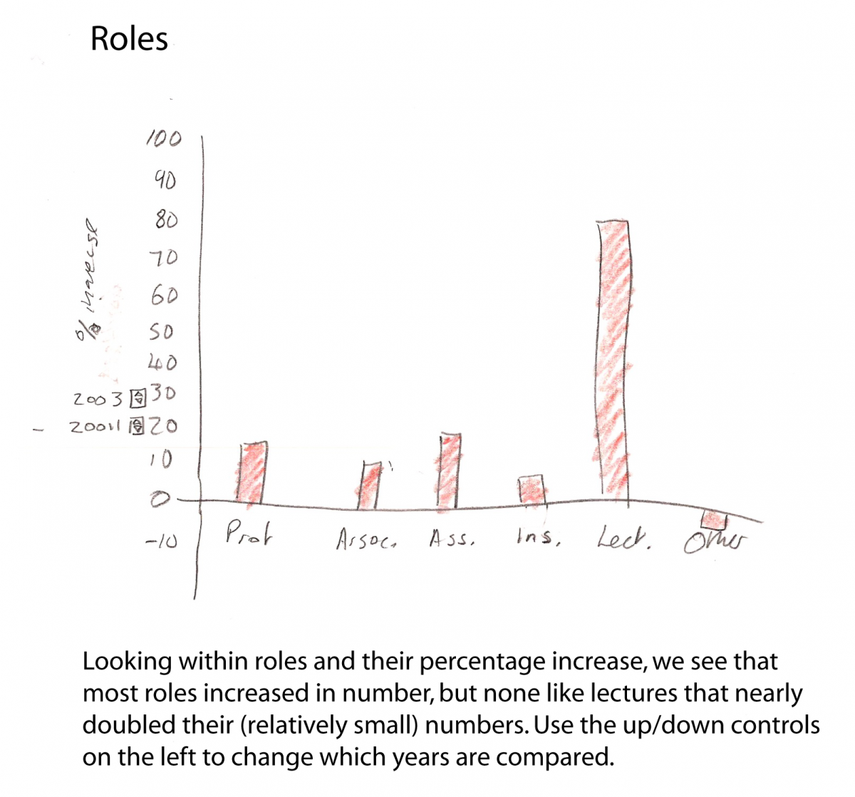
Roles Tab:
Tenure Tab:
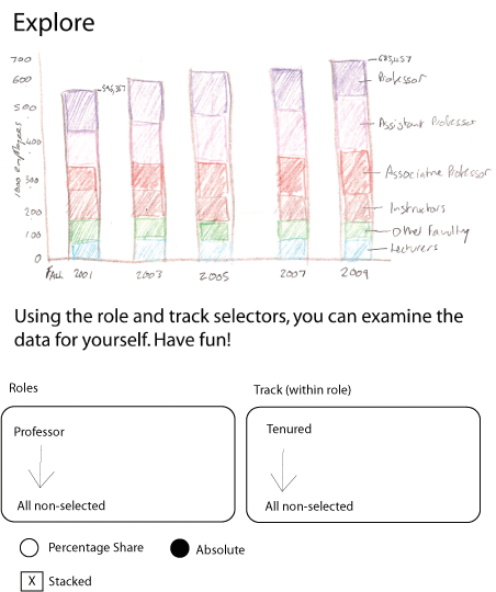
Explore Tab: