Still way behind, our challenge for week 4 was to take something from a 92-page KPMG report and make an infographic. As much of the course content for week 4 was about cartography, I felt I needed to get a map in there somewhere.
Actually, I only used one page from the report, which as a bar graph of where countries start the highest top tax rate (the report was about the highest rates, which are supposed to be somewhat representative). Mostly ignoring the fact that the number of tax rates probably makes a big difference, I thought it might be interesting the correlate/normalize the data against the household income, which I found some older data for via. Wikipedia. I had to manually type in the numbers from the KPMG report, so I hope they are right.
This week I tried to make less of an effort to use lots of data (multiple tabs, etc.) and more of an effort to find/tell a story. Somehow I found that easier with this data than with the last one. Clicking on the preview below will load the PDF.
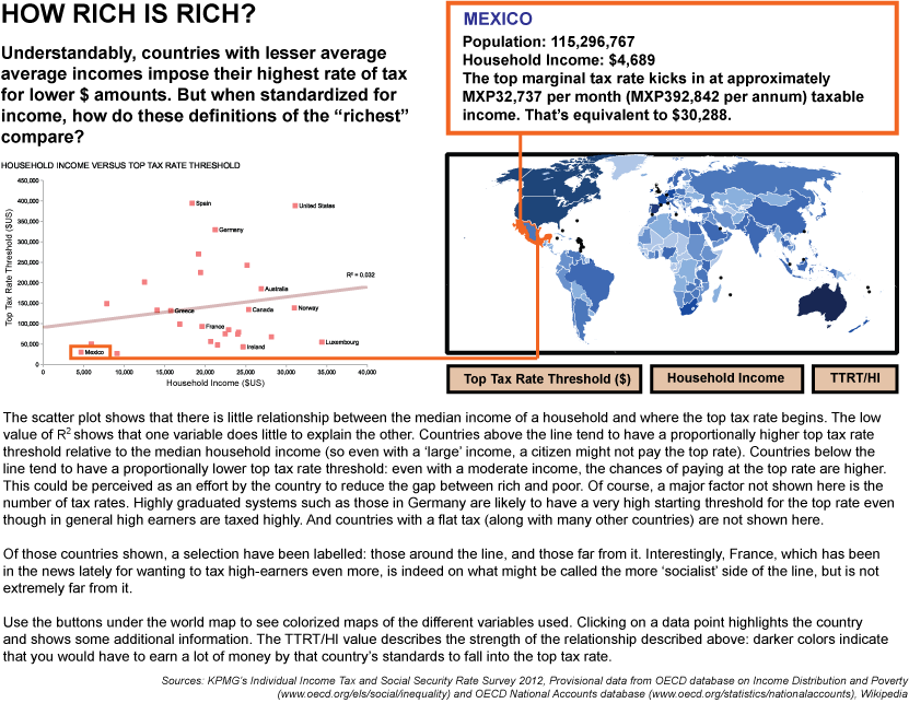
I meant to note on there somewhere what exactly median household income is - it is: "Annual median equivalised disposable household income in USD at current prices and current PPPs in 2007"
I should also point out that despite some real data in there, this should be taken as a draft - the color map is from something else in Wikimedia commons (http://upload.wikimedia.org/wikipedia/commons/8/88/British_expats_countrymap.svg) and doesn't relate to the data, and the image is of course static just showing an idea of how the mouseover interactivity would work.